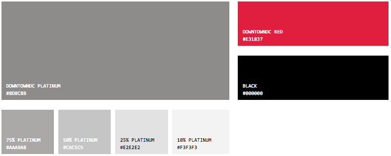
The brand for the DowntownDC Business Improvement District (BID), which was first created in 1997, is currently comprised of unique visuals to ensure the organization is instantly recognizable. The BID’s current, two-color logo, established in late 2015, features a signature “platinum” BID star, along with a typographic logo featuring platinum and black colors. Additionally, the BID continues to utilize its signature red color for branding purposes, choosing to incorporate red into the uniforms worn by the ambassadors, for trash cans, vehicles and more.
Use Policy
The BID expressly prohibits the copying of any protected materials on this website, except for the purposes of fair use as defined in the copyright law, and as described within the Terms of Use. If you are not an authorized partner of the BID, you must have express permission from the BID to download and use our logo. Please remember that the BID logo should be used correctly—it is one of our most valuable assets. To request permission, or if you have additional questions, please contact the BID.
“DowntownDC”, the Downtown Business Improvement District Corporation, the DowntownDC Business Improvement District Corporation, and the DowntownDC logo, are registered trademarks or trademarks of the Downtown Business Improvement District Corporation and its affiliates in the United States and/or other countries.
Logo Guidelines
Logo image files for most uses are available to download as a zip file. For other custom applications please contact the BID.
Primary Lockup

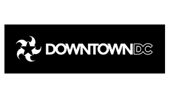
The primary DowntownDC logo, used for most applications, contains two elements, the wordmark and the star. They should never be separated or altered, but always used as seen here.
Alternate Lockup

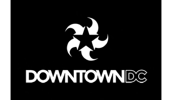
The alternate lockup should be used in vertical applications when space does not allow for a horizontal lockup.
Font Guidelines
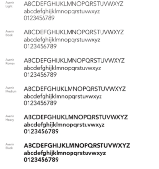
Avenir
The primary sans serif typeface for DowntownDC is Avenir. It is available in six weights with an oblique option for each. Avenir, which means “future” in French, incorporates the stylistic developments of the twentieth century. It conveys the balance, simplicity and strength of our organization. Highly legible and nuanced, Avenir has a harmonious and sensible appearance in text and is suitable for any size typography.
Our Colors